

Are you looking for more leads? Who isn't, right? In today's digital advertising and online selling world, conversions are crucial to growth. If your agency or marketing department isn't tracking conversions, you probably don't know where your revenue is coming from, how often your landing pages convert, and which campaigns bring in the most leads.
A call-to-action (CTA) is a button, image, or text link that prompts a visitor to take action. For example, a button may say "Start Your Free Trial" or "Book Now," calling the prospect to do something on the page.
Typically, CTA buttons appear at the bottom of a form or display ad. So, when it comes to learning how does a call to action increases conversions, it's essential to look at different types of CTAs and how to use them.

In most cases, the reason a lead or sale bounced off is that they weren't interested in your offer, but in other cases, it's because the CTA button didn't stand out enough.
Lots of businesses think that a simple, short CTA like "Buy Now" or "Shop Now" on their ads will make people click, but these are simply bypassed, almost like the visitor doesn't even see them. This is disappointing, especially when trying to increase customer spend.
The first purpose of a CTA is to suggest an action for the prospect to take. The second goal is to motivate them to do it now. A lot of marketers know what they want customers to do, but they can't remember the "why" that drives someone to click.
While your content on the landing page or ad must make it apparent why they should click, you may need to reinforce with a quick bulleted recap or add an arrow that points to the CTA, where you have the perfect message: "Download Free eBook Now."
Most CTA buttons have between 2 and 5 words. Brief and straightforward CTAs are best because they place importance and urgency, as well as remove any distractions taking away from your landing page.
If you want a visitor to become a lead or sale, then it's vital to have the right CTA at the right time with the right landing page or offer. Different audiences also respond to different CTAs, but you don't want to go overboard and stuff your site with too many mixed messages. Instead, it's best to focus on a single CTA that your audience will respond to.
Here are some types of CTAs that lead to conversions in different ways:
This is probably why you're here. If you have a lead generation campaign right now, what CTA are you currently using? Have you tested a second one to see if it performs better? Some of the most popular lead generation CTAs include:
The CTA button must match the offer, so this depends on your strategy to turn visitors into customers. However, you'll want to place a lead generation CTA above the fold, right where new visitors are likely to look first.
In other cases, you may want to place a lead generation button in your sidebar, banner, or even at the end of a post. Any CTA button style should be eye-catching and show inherent value for your prospect. What will they get for clicking on this button?
Most lead generation pages have a form with 2 to 3 fields like first name, email, and location, or phone number. The number of fields matters online as people on their phones won't spend more than 60 seconds trying to fill out a form.

In these cases, you don't want visitors to simply bounce off because your offer and CTA button weren't attractive enough. Some form designs incorporate the proposal into the fields, such as asking, "How will you use this free guide?" that shows a dropdown field, where the prospect can select goals or "other" to write one in.
However, you never want just to use "Submit" as a CTA for forms. Instead, add some style to it, choose a font that matches the page, and add a drop shadow to the button. This will make your form submission button stand out, so visitors want to breeze through the form to click on it.
There are a ton of CTAs for all industries that sell stuff online. Also, if you sell via social media, you likely will have to choose a CTA from a list, such as "Shop Now" and "Learn More" on Facebook.
In these cases, the text of your ads is super important. It should focus on motivating the customer to buy and providing a simple CTA in the headline to attract attention.

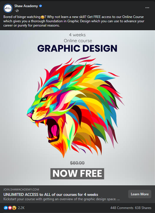
This Facebook ad uses the standard "Learn More" CTA button, but the headline is to the left, also adding to the call for action with "UNLIMITED ACCESS." The image also has a huge "FREE," so by clicking "Learn More" you feel like you have nothing to lose and everything to gain--especially if you're a graphic designer who has been targeted by this ad on Facebook.

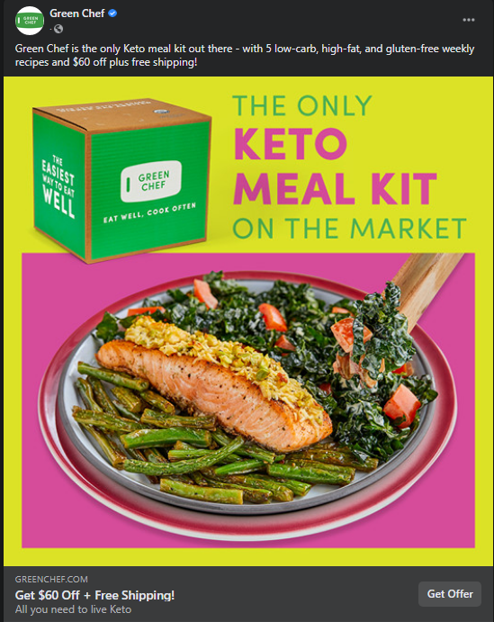
This image does stop you in your tracks, and if you're doing keto, you'll likely be targeted by an ad like this. Keto is challenging to prepare for and takes a lot of research, but this meal kit does it all and costs much less. It's smart of Green Chef to add value with "$60 Off + Free Shipping" right next to the "Get Offer" button.
Whether it's on a home page, landing page, display ad, or social ad, you want to make sure that your CTA button has the following:
Buttons are made to stand out on pages, which is why they should be placed on the right side of a page and "above the fold," which means the top half of a web page that loads first and can be seen instantly on mobile or desktop.

Visitors should see one CTA button before having to scroll down for more information. You should check your landing page design on mobile and desktop to ensure that your CTA appears after your form or lead-in text.
Font choice and readability are critical because users won't click what they don't understand. This is why brevity and a direct call-to-action are the best ways to communicate to your user what you'd like them to do.
Finally, you also want to think about the message that leads up to the CTA. What are you saying in the headline, form, and bullet points that explain what they will get for clicking? In some cases, the offer is straightforward to explain, especially if it's free.
However, in other cases, people may not click because they are afraid of a scam. In these situations, you can add some trust logos and symbols above the fold to show that you are a reputable company and won't use their information for any nefarious purposes.
When creating a CTA, you always want to think about your audience and what they'll respond to first. When CTAs work best, they simply "guide the eye to where to buy," but the messaging and design of your page influence that as well.
No matter how great your CTAs are, if your business is listed incorrectly across the web, search engines will penalize you, so it's imperative that you take control of a listing that is incorrect and fix it so you will show up higher in the search results. It's super easy to fix inaccurate listings from one dashboard with Listing Sync Software, so get in touch for a free demo.


.avif)


